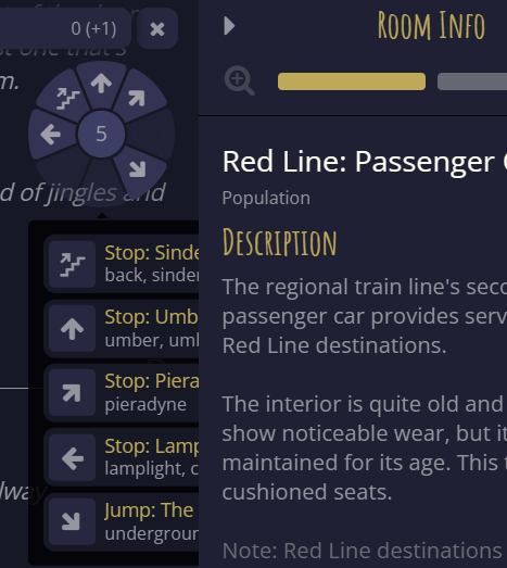
As I was traveling The Rift over the last couple days, I noticed that the exit list from the hub of the navigation wheel does not have the proper Z-order. You can see this when going to a location that does not have an area map next to the wheel which causes the list to be mostly hidden by the Room/Area info panel. Honestly.. I think the best fix for this would be to ALSO fix the wheel in position so it doesn’t move when taking an exit that transitions between area map existence, as it makes navigation using the wheel more challenging when you have to shift back and forth between rooms that contain/lack area maps.
Can you show a screenshot? I don’t understand what you mean by “Z-order.”
1 Like
The z-order is the ordering of window elements in the z axis, which for a computer screen is towards or away from you. The suggestion is that the stop list is “below” the room info panel, when it should be “above” it.
However, I do not believe this is the issue as z-index for the containing element class .tooltip is set to 1000 and the room info panel has none.
Rather, it is the left: 0 directive of the .tooltip--full class that is forcing the element to start at the same left position as the containing box that appears to be sized by the wheel and map above, or alternatively the right: 0px applied to the .overlaynav--content box containing both the wheel and the list of exits that is logically contained within it (as is the map when present).
Removing either of these directives pushes the exit list to the left when the map is not present (but removing right also pushes the wheel to align to the left as compared to below, which is probably undesirable).
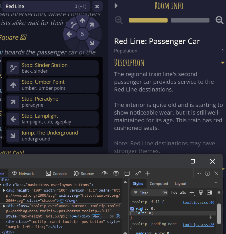
Of course, other tooltips may need this behaviour, so a targeted override may be more suitable.
The z-index does not have the effect Vernon might expect because the two panels are non-overlapping high-level divs in a flexbox arrangement and the ‘tooltip’ is not fixed within the overall viewport but absolutely positioned with respect to other elements in the central panel, thus as I understand it subject to its clipping. (Disclaimer: I am not a CSS expert.)
Thanks for the deep-dive on that, Green. Sadly, while I could dig into the code and try to figure it out.. I was just too lazy. The system used to work fine, it just seems this latest update did something to change that. Or else an update to Firefox changed the behavior. Either way, it was working fine last week with the exit list showing on top of the Room Info panel, which is how I expect it to behave. Indeed, shifting to the other side does cause trouble, instead of simply sliding my eyes up and down I now have to jog to the side and then back so while inconvenient, it is less desirable than previous behavior.
From my mucking about, GreenKeeper is correct. The compass UI is a child element of the character log, which has overflow:hidden from multiple CSS rules. Therefore, it is clipped to the character log’s confines.
If you remove all such overflow: hidden properties, a scroll bar appears, and scrolling to the right shows the rest of the exits:
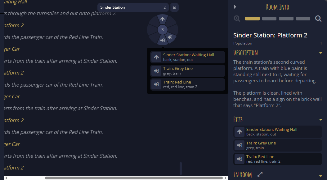
It seems strange to me that this supposedly displayed as desired before but not now. That indicates that, in the HTML, the compass UI was moved from outside the character log to inside it for some reason. 'cause I can’t think of any way to make it display as desired while remaining within the character log element.
1 Like
This has just been fixed in Release v1.73.0 - Custom theme