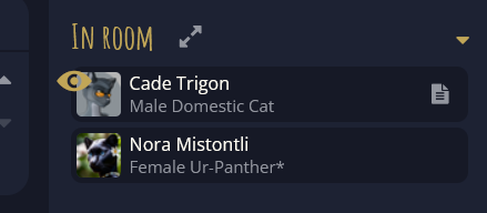
Yellow Lines are currently used to show who is looking at who.
Might I suggest making this an eyeball icon. If not enough room on the left, place it on the right, or within the dark blue boundary box on the right where there is empty space, in the same space the “Notes” icon appears when hovering.
I vote for keeping the line and maybe put something in the noob onboarding about it. An eyeball icon is going to be annoyingly small on a small screen, and we have a lot of mobile users.
Hmm, maybe move that icon to the right of the character’s name? just so that it doesn’t get cluttered with the character portrait, as I could see a heavily yellow icon blending in and making the eye basically the same as the current line.
Eyeball might work but not on small screens (mobile/tablets) where it would just become too small.
The yellow lines are very easy to see even on smaller displays.
Dunno what that is so…
Maybe other users are in the same boat, there. I wouldn’t mind a nice big bright eye but on my tablet it would be a very small white circle.
And, for a new user, the eye would mean… they’re looking at me, or I’m looking at them, or… ?
Yes, the yellow bar is narrower. But if the discussion is doing away with it and adding something to replace the bar, Xetem is right. That yellow eyeball is going to get lost on some of the yellow-dominated images. By moving it off the image itself and next to the name, in what is going to be just 2-3 character spaces where text is already designated as varying, it provides a good location.
As for ‘am I looking at them or are they looking at me’, it’s pretty obvious because you looking at someone changes an entirely different UI panel. There’s only so much handholding a design can provide before that makes it ultra-cluttered.
For the eyeball, just having it to the spot next to the ‘notes’ icon would suffice, IMO. It would be directly opposite the character icon so would not get in the way or get lost, still be visible(ish) and players would soon grow accustomed to it.
And it’s far more subtle, thus easily overlooked.
So you mean appended to the name rather than prepended, or adding a designated block before the name so the name isn’t shifting? I can certainly understand it. But bouncy would draw the eye to let you know they are looking which might be helpful. Right now, the yellow line goes unnoticed by me a lot more than I would like.. So there are arguments in both directions.
Yes, Windchaser is right that we do have a lot of mobile users, which is another complaint I brought up and was rashed for harshly by those who believe that small screen users should change their interface rather than those players altering their behavior in game.
Too easily lost in high signal areas like the Park, or when the action is flowing swiftly.
I am solidly in the yellow bar park, but that’s just me. It’s static, easily noticed no matter how busy the traffic, and does not impede the visual interface.